If there’s one thing that most successful insurance and financial advisors have in common, it’s a willingness to build things from the ground-up.
They don’t chase after quick hacks with short expiry dates.
And while they love efficiency, they don’t believe in taking risky shortcuts just to earn a quick buck.
Instead, they (1) establish strong funnels that collect leads, (2) turn those leads into meetings, and then ultimately (3) turn those meetings into clients who produce commissions, fees, and/or AUM.
They know that, once a funnel is put in place, it has the ability to generate a steady drip…drip…drip of qualified and affluent prospects.

But funnels don’t have to be super complex.
One of the best funnel strategies around – a funnel that’s helped numerous clients generate 7-figure returns – is built around nothing more than a quiz.
Read on to discover some of the best tips for creating high-converting quiz landing pages that can serve as the backbone of your next lead generation funnel.
Why Quizzes?
You can use any number of lead magnets to collect leads and jumpstart your funnel, but quizzes are a great place for advisors to begin.
They’re perfect for most insurance and financial advisor prospecting strategies, because they allow you to do two important things simultaneously:
1. Quizzes let you gather information directly from your target audience and better understand their needs. Depending on the nature of your quiz, you may be able to find out how much AUM a client has, what sort of financial products they’re interested in, or how long they have until retirement.
2. Quizzes allow you to better prepare for a meeting by understanding your prospect’s biggest pain points, wants, needs, and expectations. The prospect is basically giving you the keys to their brain. You can use this to tailor a message that resonates.
Best of all, quizzes are simple and you can use them as an excuse to send out a related lead magnet that further educates the prospect and helps move them closer to setting up a meeting.
[cboxarea id=”cbox-x4sRETdqZv7HQIyl”]
Why a Dedicated Landing Page?
Quizzes can be disseminated via any number of platforms, including social media, SMS, or email.
But they’re most powerful when initiated through a dedicated landing page. This approach gives you the best opportunity to collect information (using Facebook pixels) and deliver a world-class quiz experience.
Best of all, landing pages are designed to convert. Unlike other web pages, where it’s easy to get distracted, a dedicated landing page is optimized to get the visitor to take one specific action.
In this case, that specific action is to fill out the quiz.
Optimize Your Quiz Landing Page for a Better Insurance or Financial Advisor Prospecting Strategy
While it’s not very difficult to create a quiz landing page, many insurance and financial advisors unknowingly overcomplicate things.
When optimizing a quiz landing page, best-in-class advisors always focus on the following:
1. Strip Away All Distractions
The first key is to remove all distractions.
The only goal of your landing page is to get people to fill out the quiz.
That’s it.
You don’t want them to click over to another page, read your latest blog post, or check out your credentials.
You just want them to take the quiz.
This is why you should use a true landing page, rather than just creating another page on your existing website.
This allows you to remove the navigation menu and any other links that could potentially direct people away from the quiz.
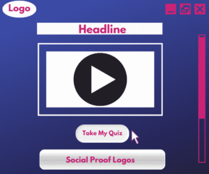
2. Develop a Laser-Focused Headline
Your headline will be the first thing someone sees when they click on your landing page – make it strong and focused.
It doesn’t have to be fancy. It just needs to direct people to take the quiz and provide an incentive for doing so.
Here’s an example:
Complete this quiz now to get your two valuable retirement bonuses and the first chapter of my book…only takes 60 seconds.
You’ll want to come up with a couple of different headlines and test them to see what works with your audience, but this at least gives you an idea of what a headline could look like.
3. Record a Short Video
Your quiz page should have its own dedicated video that engages people and highlights the benefits of taking the quiz.
It should be short and sweet (2 minutes or less) and follow this basic outline:
- Congratulate them on taking the first step
- Highlight the benefits of taking the quiz
- Highlight the bonuses that they’ll get
- Hold up a physical copy of the bonus as you talk (book, PDF printout, etc.)
- Restate the CTA (take the quiz) at the end and preview next steps
Here’s a sample off-the-cuff script you could implement:
“Hey congratulations on joining me on my site and taking my quiz!
I want you to know that this quiz will be a short process that will give you clarity and help you know how ready you are to retire.
Then, at the end of this quiz, as a thank you for taking it, I’m going to send you two valuable bonuses. One is going to be the first chapter of my book called, “Book Name.” The second is going to be a really handy checklist that will help you take the next step. So, whether you want to do this on your own, or work with somebody like myself (or another advisor), you’re going to have so much more clarity than most people do when they enter into retirement.
Go ahead and take the quiz and I’ll see you on the next page!”
Do you see how simple and quick that is?
You’re not making a Oscar-worthy short-film…you just want to humanize your landing page and establish quick rapport.
4. Include a Quiz Button
Don’t make the mistake of showing the entire quiz up front.
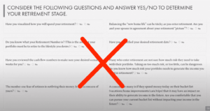
Researchers have tested quiz landing page formats over and over again, and there’s conclusive data to suggest that displaying all questions at once is not effective.
It overwhelms users and lowers the likelihood that they’ll actually fill out the quiz.
It’s much better to display one question at a time.
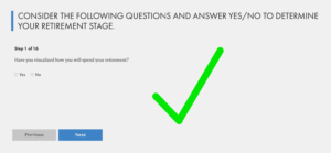
It’s also important that you embed the quiz into the landing page, rather than directing the lead to a separate quiz page. (Remember, you’re trying to reduce distractions and limit friction.)
You can use TypeForm to embed a quiz into your landing page.
5. Leverage Your Social Proof
In addition to a headline, video, and quiz, I’d also include some form of social proof on your landing page.
If you’ve been featured in any media publications, consider adding a collection of logos to show off your expertise.
Retirement advisor Mark Singer does it well on his page.

For best results, keep these logos “above the fold.”
In other words, don’t paste them at the bottom of the page where they’re unlikely to get much visibility. Instead, move them near the top of the page so that you instantly establish trust and authority with prospects. (Which further compels them to fill out the quiz.)
Learn More With (Free) Weekly Power Hour for Advisors
The system outlined in this article is a simplified explanation of an intricate 7-figure funnel that I recently spent 60 minutes teaching to 2,000+ insurance and financial advisors.
If you’d like to FREE access to these weekly workshops and masterclasses, all you have to do is reserve a spot and show up LIVE. (We don’t do replays.)
Every week, we flip on the camera and spend an hour teaching the tips and tactics that are working in our industry right NOW.
No hyperbole, generalities, or filler…just tangible tips you can implement right away.
Register for the Virtual Advisor Power Hour by clicking HERE…and become one of the 10,000 advisors we’re helping double their businesses and get 100 days off a year!

